How to Structure Frontend Codebases for AI Coding Agents
AI coding agents generate better frontend code when the codebase gives them reusable components, Storybook states, design tokens, scaffolds, validation gates, and durable task context they can retrieve instead of reinventing.
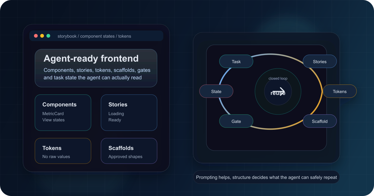
Three days before a customer pilot, our PM asked if the analytics dashboard would ship by Friday. The design was ready: metric cards on the 4px grid, filters annotated across breakpoints, a chart that told a clear revenue story. I said yes because the UI was straightforward and I had AI help.
By Wednesday morning, the PR was still in draft. The hard part was not the dashboard. The hard part was undoing what the agent invented. It created a new metric card even though the product already had one, used Tailwind classes outside the theme, imported a table library we did not use, then wrote browser tests that had to log in and click through three screens to inspect one component.
The code worked in the narrow sense. It also created a maintenance problem.
That is the failure mode this article is about: AI coding agents reflect the frontend design system they can see. If the reusable components, Storybook states, design tokens, scaffolds, validation gates, and task contract are not visible at the moment of generation, the agent fills the gaps with whatever pattern looks plausible. Better prompts help, but structure beats prompting in AI assisted frontend development.
Short answer
A scalable frontend codebase for AI coding agents is a codebase where the right path is machine-readable: reusable UI primitives, visible component states, token-only styling, scaffolded file shapes, validation gates, and durable task context all point the agent toward the same implementation.
Use this roadmap:
- Separate stateful containers from presentational components.
- Publish component states through Storybook, a component manifest, or both.
- Force styling through design tokens and theme variables.
- Generate from scaffolds, then block drift with lint, types, tests, and review gates.
- Store task scope, acceptance criteria, artifacts, and workflow locks where agents can retrieve them after the chat session changes.
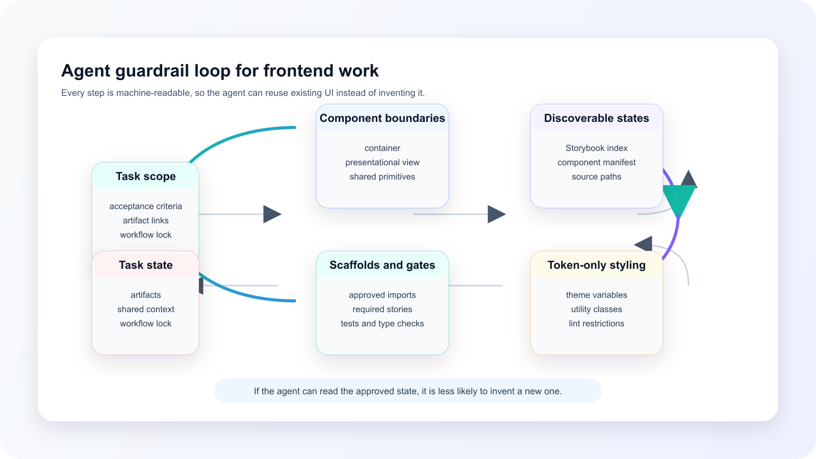
The rest of this guide shows how to build that loop. The details matter because frontend drift is rarely one bug. It is a chain: unclear task scope creates broad generation, broad generation creates invented components, invented components ignore tokens, ignored tokens trigger review churn, and review churn forces humans to reconstruct what the agent should have known.
Why prompts alone do not fix AI frontend drift
My first fix was a longer prompt. I added examples, rules, naming conventions, and a project instruction file that explained the design system in painful detail. The results improved a little. They did not become reliable.
The reason is simple: a prompt is working memory, not architecture. Anthropic's context engineering guidance treats context as finite and recommends high-signal context, efficient tools, just-in-time retrieval, file paths, and structured notes for long-horizon agent work [8]. In a frontend repo, those ideas translate into a practical rule: do not make the agent remember the design system from prose if it can query the actual component index, story file, token map, scaffold, or task artifact.
For the adjacent economics of keeping agent context small, keep token efficiency in AI-assisted development as related reading [14]. This refresh does not reuse numeric claims from that post.
Here is the kind of inconsistent output that comes from a codebase without visible constraints:
// Metric card generated on Monday
export const RevenueCard = () => (
  <div style={{ borderRadius: '12px', padding: '24px' }}>
    <span style={{ color: '#6B7280' }}>Total Revenue</span>
    <strong>$124,500</strong>
  </div>
);

// Table generated on Tuesday
import { DataGrid } from '@mui/x-data-grid';

// Filter generated on Wednesday
import styles from './FilterPanel.module.css';

// Chart shell generated on Thursday
import styled from 'styled-components';
The problem is not that the agent cannot write React. It can. The problem is that all four snippets are locally reasonable and systemically wrong. A frontend lead does not need more creativity here. They need reuse.
Community language in the research said the same thing in rougher terms: people complain about generic-looking UI, missing prior art, custom MCP security concerns, and the need for strict lint, typing, tests, and review. Treat that as voice-of-customer, not proof. The evidence-backed point is narrower: agents need high-signal context close to the task, and frontend codebases can provide it through structure.
Layer 1: Make component boundaries obvious
Start by separating state from representation. Keep data fetching, permissions, retries, and feature flags in a container. Put display states in a presentational component that only talks to your UI primitives and tokens.
// Container: owns data fetching, permissions, and retries.
export function RevenueCardContainer() {
  const { data, error, isLoading } = useRevenue();

  if (isLoading) return <RevenueCardView state="loading" />;
  if (error) return <RevenueCardView state="error" message="Revenue unavailable" />;
  if (!data) return <RevenueCardView state="empty" message="No revenue yet" />;

  return (
    <RevenueCardView
      state="ready"
      value={data.value}
      previousValue={data.previousValue}
    />
  );
}

// View: owns UI states and tokenized presentation.
export function RevenueCardView(props: RevenueCardViewProps) {
  if (props.state === 'loading') return <MetricCard loading label="Revenue" />;
  if (props.state === 'error') return <MetricCard label="Revenue" error message={props.message} />;
  if (props.state === 'empty') return <MetricCard label="Revenue" empty message={props.message} />;

  return (
    <MetricCard
      label="Revenue"
      value={props.value}
      previousValue={props.previousValue}
      format="currency"
    />
  );
}
This is where Atomic Design still earns its place. Brad Frost defines atoms, molecules, organisms, templates, and pages, and frames the method as a way to see interfaces as both parts and whole [1]. You do not need to enforce the stages as a rigid process. The useful idea for AI-assisted frontend development is that each layer should make a smaller decision than the layer above it.
In practice:
- Atoms encode primitive design choices such as text, icons, skeletons, and buttons.
- Molecules encode useful combinations such as a metric value, label, trend, or filter.
- Organisms encode full interface chunks such as a metric card, data table, or chart panel.
- Templates and pages compose those chunks around real routes and data.
AI coding agents do better when the request changes from "make a dashboard card" to "compose MetricCard with the existing RevenueCardView states." That is not a model claim. It is a practical inference from the architecture: the agent has fewer unsupported decisions to make.
Layer 2: Make existing UI discoverable before agents invent new UI
The second layer is discoverability. If the agent cannot find the existing button, card, table, or empty state, it will often create another one.
Storybook is useful here because it is already structured around component examples. Storybook can be built as a static app for review and collaboration [3], and its test-runner docs describe remote Storybooks using an index.json, formerly stories.json, as a static index of stories [16]. Component Story Format gives teams a structured way to write component examples as stories [4].
That means a generated UI task can start by querying what already exists:
{
  "v": 5,
  "entries": {
    "shared-web-atoms-button--default": {
      "type": "story",
      "id": "shared-web-atoms-button--default",
      "name": "Default",
      "title": "Shared/web-atoms/Button",
      "importPath": "../../packages/frontend/web-atoms/src/components/Button/Button.stories.tsx",
      "componentPath": "../../packages/frontend/web-atoms/src/components/Button/index.tsx",
      "tags": ["dev", "test", "style-system"]
    }
  }
}
The important fields are boring: story title, story ID, import path, component path, and tags. Boring is good. Those fields let an assistant answer "what do we already have?" before it writes code.
For visual inspection, map the story ID to an iframe URL:
http://localhost:6006/iframe.html?viewMode=story&id=shared-web-atoms-button--default&globals=Then give the assistant the rendered state, not a vague instruction to "match the design system."

Component manifests and Storybook MCP are promising, but treat them carefully. Storybook maintainers have proposed manifest and MCP-serving patterns for agent-readable design systems, and practitioner notes describe curated component APIs, stories, tests, and manifests as useful agent context [11] [12]. That is emerging practice, not the same kind of stable fact as /index.json in the Storybook docs.
The safe rule today: expose the UI states you already trust, then let newer manifest and MCP patterns improve retrieval as they mature.
Layer 3: Make styling token-only
Component reuse solves structure. Tokens solve visual drift.
Design tokens are named values for design decisions. The Design Tokens Community Group's 2025.10 format report describes a technical file format for exchanging tokens and defines tokens as name/value information with optional properties such as type and description [2]. Tailwind's theme variables give the same idea a concrete implementation path: project design tokens can map to utility classes and CSS custom properties [5].
The agent should not choose between #6366f1, rgb(99 102 241), text-indigo-500, and a custom CSS module. It should use the vocabulary your system exposes.
:root {
  --color-action-primary: #6366f1;
  --color-action-primary-hover: #4f46e5;
  --color-surface-page: #f9fafb;
  --color-surface-card: #ffffff;
  --color-content-primary: #111827;
  --color-content-secondary: #4b5563;
  --elevation-sm: 0 1px 2px 0 rgb(0 0 0 / 0.05);
}

.dark {
  --color-surface-page: #111827;
  --color-surface-card: #1f2937;
  --color-content-primary: #f9fafb;
  --color-content-secondary: #d1d5db;
  --elevation-sm: 0 1px 2px 0 rgb(0 0 0 / 0.2);
}
Then components reference semantic utilities:
export const Card = ({ children, variant = 'default' }: CardProps) => (
  <div
    className={cn(
      'rounded-lg bg-surface-card text-content-primary',
      variant === 'elevated' && 'shadow-sm',
      variant === 'outlined' && 'border border-border-default'
    )}
  >
    {children}
  </div>
);
The specific implementation can vary. Some teams keep tokens in JSON. Some keep theme variables in CSS. Some use Tailwind as the ergonomic layer. The invariant is more important than the tool: raw visual decisions should be rare, named, reviewed, and blocked when they bypass the system.
Figma and Atlassian both describe the same broad direction from a product-practice angle: design-system context can help AI reuse components, apply tokens, reduce duplication, and scaffold coherent interfaces from primitives and tokens [9] [10]. Those are third-party claims, but they match the operational shape frontend teams already recognize.
Layer 4: Prefer composition over configuration
Agents struggle with universal components because humans do too.
A 60-prop table component looks powerful until the assistant has to infer which props are allowed together, which are legacy, and which are only valid for one product area.
// Configuration-heavy API
<DataTable
  data={transactions}
  columns={columns}
  pagination
  paginationPosition="bottom"
  pageSize={10}
  filterable
  filterPosition="header"
  selectable
  selectionMode="multiple"
  expandable
  loading={isLoading}
  headerSticky
  virtualized
  rowActions={rowActions}
/>
Composition gives the agent smaller, named decisions:
<DataTable data={transactions} columns={columns}>
  <DataTableToolbar>
    <DataTableFilter column="status" options={statusOptions} />
    <DataTableSearch placeholder="Search transactions..." />
    <DataTableViewOptions />
  </DataTableToolbar>

  <DataTableHeader sticky offset={64} />

  <DataTableBody
    loading={isLoading}
    emptyState={<EmptyTransactions />}
    expandedRow={(row) => <TransactionDetails transaction={row} />}
  />

  <DataTableFooter>
    <DataTableSelection mode="multiple" onSelectionChange={handleSelection} />
    <DataTablePagination pageSize={10} pageSizeOptions={[10, 25, 50]} />
  </DataTableFooter>
</DataTable>
This section is practical inference, not a claim from an external benchmark. Focused slots are easier to fill than a large prop matrix. They make code review clearer too: reviewers can see whether the assistant used the right subcomponent instead of scanning a long prop list for conflicting settings.
The bridge to generation is direct. Once the component shape is compositional, a scaffold can create the right files and the right edit zones before the assistant starts filling in behavior.
Layer 5: Generate from scaffolds, then validate the output
AI behaves better in a guardrailed sandbox than in an empty file.
A useful frontend scaffold does more than create a component folder. It creates the contract around the component:
- file structure
- approved imports
- required stories
- allowed edit zones
- acceptance criteria
- validation commands
For a metric card, the scaffold might create:
MetricCard/
  MetricCard.tsx
  MetricCard.stories.tsx
  MetricCard.test.tsx
  index.ts
Then the task instruction becomes narrow:
Implement the ready state in MetricCard.tsx.

Use:

- existing Card, Text, TrendIndicator, and Skeleton components
- token-only styling
- stories for loading, empty, error, and ready states

Do not:

- add UI dependencies
- create a second metric card component
- write browser tests for this component unless the acceptance criteria asks for one

Run:

- typecheck
- lint
- component tests
- Storybook render check
That is the same principle as scaffolding for AI-assisted development: reduce the size of the decision space before generation starts [15]. When the scaffold supplies imports, file shape, stories, and verification commands, the agent can spend its effort on the actual component rather than reconstructing the repo's conventions.
Validation is the second half of the pattern. ESLint's no-restricted-imports rule can disallow specified imports, which supports dependency gates against unsupported UI libraries or import paths [6]. Type checks catch shape errors. Component tests catch state errors. Storybook visual checks catch missing states. Architecture rules catch drift before review, which is the same broader loop discussed in enforcing architectural patterns when AI generates code.
Do not let the agent decide the gate set from scratch. Put the gates in the scaffold, the task, or the shared workflow. The assistant can run them, but the team should own what "done" means.
The AI frontend guardrail checklist
Use this checklist before you ask an agent to build or modify a frontend component.
| Failure mode | Control | Where the agent reads it | Gate that catches drift |
|---|---|---|---|
| Duplicate component | Storybook index, component search, component manifest | /index.json, source paths, task artifact | Review, import checks, story coverage |
| Random styling method | Design tokens and Tailwind theme variables | Token files, theme variables, style-system instructions | Lint, design review, visual checks |
| Unsupported dependency | Import restriction and package allowlist | ESLint config and scaffolded imports | no-restricted-imports, package review |
| Missing states | Required stories for loading, empty, error, and ready | Story files and acceptance criteria | Storybook, component tests |
| Overbuilt browser tests | Shared test helpers and clear test scope | Test guidelines and task instructions | Test review, CI runtime checks |
| Lost plan across sessions | Durable task state, artifacts, workflow locks | Agiflow task, artifact links, board status | Acceptance criteria, workflow review |
Where Agiflow fits: durable work state for external AI assistants
Frontend consistency is not only a design-system problem. It is also a work-state problem.
Agiflow's positioning is intentionally narrow: it is a project board that connects external AI assistants over MCP. The assistant stays the agent. Agiflow supplies scoped board tools, prompt skills, shared state, artifacts, vault entries, and workflow locks for tools such as ChatGPT, Claude, Cursor, Claude Code, Codex, and Antigravity to read and update [13]. MCP itself is an open standard for connecting AI applications to systems where data and tools live [17], and the MCP introduction describes external systems that include data sources, tools, and workflows [7].
For frontend work, that matters because the codebase cannot hold the whole contract. A Storybook index can show that MetricCard exists. A token file can show that bg-surface-card is allowed. A scaffold can create the right files. But the task still needs to say what should be built, which states count as complete, which artifacts prove the work, and whether another assistant is already editing the same contract.
Here is the kind of task state that makes an agent-ready frontend task less ambiguous:
{
  "title": "Build dashboard revenue metric card",
  "acceptanceCriteria": [
    "Reuse existing MetricCard primitives",
    "Cover loading, empty, error, and ready states in Storybook",
    "Use token-only styling",
    "Do not add UI dependencies",
    "Attach Storybook URL and validation output as artifacts"
  ],
  "artifacts": [
    "Storybook index query result",
    "MetricCard source path",
    "Scaffold command",
    "Typecheck and lint output"
  ],
  "workflowLock": "dashboard-metric-card"
}
The value is not that the board writes better JSX. It does not write JSX at all. The value is that every assistant can re-read the same task contract after context changes. That is the practical version of acceptance criteria as durable AI work state, AI coding team shared state, and the AI coding tool control surface.
If multiple assistants touch the same frontend, the task record becomes the coordination surface. One assistant may scaffold. Another may implement. A third may review. The handoff works only if role boundaries, artifacts, and verification gates are explicit, which is why role separation and verification gates for multiple agents belongs next to the frontend design-system conversation.
Implementation roadmap
Do not try to make the whole frontend agent-ready in one pass. Start with one component family where drift is already costing review time.
- Audit recent PRs and list the repeated AI drift: duplicate components, unsupported imports, raw colors, missing states, oversized tests, or lost task scope.
- Pick one component family, such as metric cards, filters, buttons, or tables.
- Define the canonical states for that family and publish them as Storybook stories or a component manifest.
- Move raw styling decisions into design tokens and theme variables.
- Scaffold the component shape, including stories, tests, allowed imports, and edit zones.
- Add lint, type, component-test, and story-render gates to catch drift before human review.
- Externalize the task contract in a shared project board so scope, acceptance criteria, artifacts, and locks survive the session.
The order matters. If you add gates before you have reusable components, the agent gets blocked without a good path forward. If you add stories without task state, the agent can still work on the wrong thing. If you add task state without codebase structure, the board preserves an unclear contract.
Make the desired route visible first, then make drift cheap to catch.
The path forward
AI-assisted frontend development scales when the system makes the correct choice easier than the improvised one.
That means reusable components instead of one-off UI. Storybook states instead of vague design-system prose. Tokens instead of raw styling. Scaffolds instead of empty files. Gates instead of review-only correction. Durable task state instead of a plan trapped in the prompt.
Use the frontend AI guardrail checklist on the next component task before asking an assistant to write code. If the component, states, tokens, scaffold, gates, and task contract are visible, the agent has a smaller and better problem to solve.
That is the real roadmap: not longer prompts, but a frontend system that agents can actually reuse.
References
- Brad Frost: "Atomic Design, Chapter 2." https://atomicdesign.bradfrost.com/chapter-2/ . Captured 2026-07-04. Verified source: defines atoms, molecules, organisms, templates, and pages, and frames atomic design as a parts-and-whole mental model.
- Design Tokens Community Group: "Design Tokens Format Module 2025.10." https://www.designtokens.org/TR/2025.10/format/ . Captured 2026-07-04. Verified source: describes a technical exchange format for design tokens and defines token name/value information with optional properties such as type and description.
- Storybook Docs: "Publish Storybook." https://storybook.js.org/docs/sharing/publish-storybook . Captured 2026-07-04. Verified source: Storybook can be built as a static web application for review and collaboration.
- Storybook Docs: "Component Story Format." https://storybook.js.org/docs/api/csf/index . Captured 2026-07-04. Verified source: Component Story Format is Storybook's structured format for writing component examples.
- Tailwind CSS Docs: "Theme variables." https://tailwindcss.com/docs/theme . Captured 2026-07-04. Verified source: Tailwind theme variables define project design tokens that map to utility classes and CSS custom properties.
- ESLint Docs: "
no-restricted-imports." https://eslint.org/docs/latest/rules/no-restricted-imports . Captured 2026-07-04. Verified source: ESLint can disallow specified imports. - Model Context Protocol Docs: "Introduction." https://modelcontextprotocol.io/docs/getting-started/intro . Captured 2026-07-04. Verified source: MCP connects AI applications to external systems, including data sources, tools, and workflows.
- Anthropic Engineering: "Effective context engineering for AI agents." https://www.anthropic.com/engineering/effective-context-engineering-for-ai-agents . Captured 2026-07-04. Authoritative publisher claim: agents benefit from high-signal context, efficient tools, just-in-time retrieval, file paths, structured note-taking, and sub-agent patterns for long-horizon work.
- Figma Blog: "Design Systems and AI." https://www.figma.com/blog/design-systems-ai-mcp/ . Captured 2026-07-04. Third-party product claim: design-system context can help agents reuse components, apply tokens, reduce duplication, and bridge design and engineering.
- Atlassian Blog: "Building the context engine for the AI era." https://www.atlassian.com/blog/ai-at-work/atlassian-design-system-building-the-context-engine-for-the-ai-era . Captured 2026-07-04. Third-party product practice claim: a layered design-system composition model can use primitives and tokens to help builders scaffold coherent interfaces.
- Storybook design systems with agents RFC. https://github.com/storybookjs/ds-mcp-experiment-reshaped/discussions/1 . Captured 2026-07-04. Proposal, not stable fact: maintainers proposed component manifests and MCP serving patterns for agent-readable design systems.
- Codrops: "Supercharge Your Design System with LLMs and Storybook MCP." https://tympanus.net/codrops/2025/12/09/supercharge-your-design-system-with-llms-and-storybook-mcp/ . Captured 2026-07-04. Third-party practitioner claim: curated component APIs, stories, tests, and manifests can provide high-signal context for coding agents.
- Agiflow first-party positioning source:
apps/agiflow-app/docs/marketing/keyword-clusters.md. Captured 2026-07-04 from the local repository. Verified source: Agiflow is positioned as a project board that connects external AI assistants over MCP while supplying scoped board tools, prompt skills, shared state, artifacts, vault entries, and workflow locks. - Agiflow: "Token Efficiency in AI-Assisted Development." /blog/token-efficiency-in-ai-assisted-development. First-party related reading. Numeric claims from this post were not reused in this refresh.
- Agiflow: "Scaling AI-Assisted Development with Scaffolding." /blog/toward-scalable-coding-with-ai-agent-better-scaffolding-approach . First-party related reading on scaffolding as a consistency mechanism for AI-assisted development.
- Storybook Docs: "Test runner." https://storybook.js.org/docs/writing-tests/integrations/test-runner . Captured 2026-07-04. Verified source: remote Storybooks can use
index.json, formerlystories.json, as a static index of stories. - Model Context Protocol TypeScript SDK: "MCP TypeScript SDK." https://ts.sdk.modelcontextprotocol.io/v2/ . Captured 2026-07-04. Verified source: MCP is described as an open standard connecting AI applications to systems where data and tools live.
More to read
How to Build an AI Code Review Workflow in Agiflow
Build a decision-ready review queue for AI-generated code with a clear task contract, inspectable evidence, visible gaps, and a named human decision.
11 min readClaude Code Tasks Limitations: Where Native Tasks Stop for Teams
Claude Code Tasks is useful local orchestration, but it is not a shared system of record. This refreshed guide maps what Tasks stores, how it differs from sessions, memory, and artifacts, and when teams need an MCP-readable project board.
13 min readHow To Run AI Coding Agents Across Machines Without Duplicate Work
More AI coding agents only help when ownership, state, and proof survive outside a single session. This refreshed guide shows how Agiflow uses CLI runners, workflow locks, atomic claims, device identity, and artifacts to coordinate agent work across machines without duplicate branches or lost handoffs.
12 min read